
Dropson presents its new visual identity
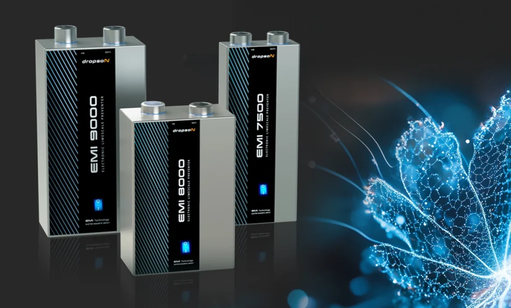
A new look, the same commitment to water and nature.
Dropson launches a renewed visual identity. A change that goes beyond design: it expresses who we are, what we believe in, and the future we want to build together with our clients, partners and a sector that is becoming increasingly global.
This evolution stems from a conviction that has guided us since our beginnings:
Nature is the most powerful source of innovation.
Observing its processes, balance and intelligence has always been our greatest inspiration for developing sustainable physical water treatment technologies. Today, this parallel between nature and technology also shapes our visual communication.
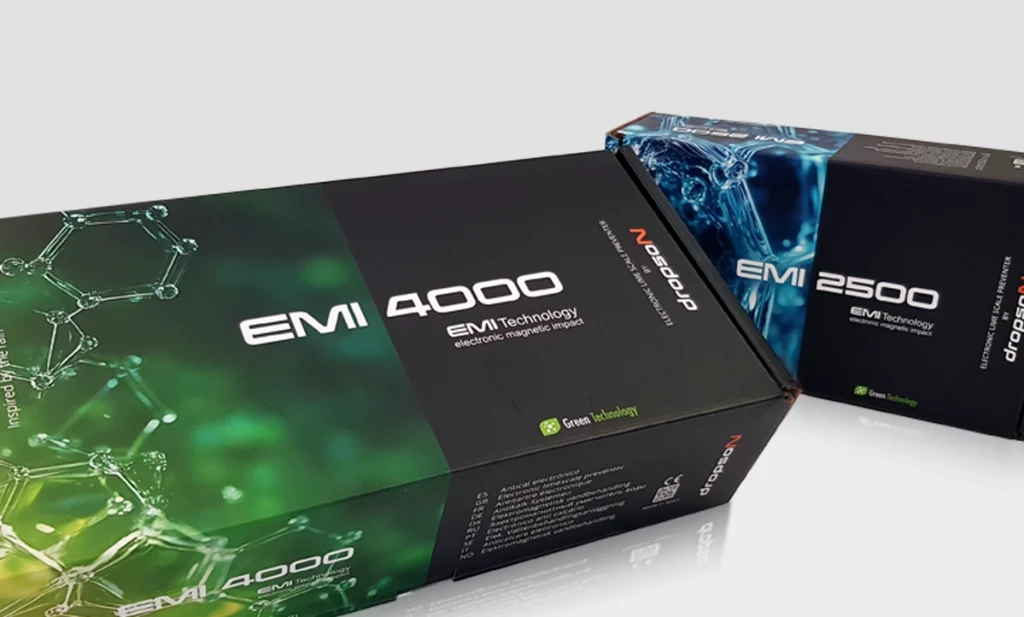
On our new website, materials, packaging and campaigns, you won’t find generic waves or drops. You will discover magnified natural structures, organic forms, complex systems: a reflection of biological intelligence turned into technical innovation.
Why this change now?
This rebranding reflects a natural evolution in our journey.
It responds to new sector trends, the transformation of our audience and our international expansion.
With the incorporation of new countries and markets, we felt the need for a strong, recognizable identity aligned with the values we share with our clients.
What does this transformation bring to our clients and partners?
• Greater message clarity, with more direct, accessible and visual communication.
• Better product experience, thanks to more intuitive and user-friendly materials.
• Stronger alignment with Dropson’s values such as sustainability, innovation and environmental respect.
• An even more responsible approach, with reduced materials, simplified packaging and more sustainable suppliers.
• Recycled cardboard and optimized processes that reinforce our ecological commitment from the inside out.
An image aligned with our essence
This aesthetic may not be usual in our sector. And that is intentional. Dropson doesn’t want to communicate like everyone else, because Dropson isn’t like everyone else. Our new visual identity blends science, elegance and sustainability while staying true to our DNA.
This change is not just a matter of appearance, but of substance. It is an act of coherence, a sign of maturity. A way to consolidate ourselves as an international, professional and ever-evolving brand, without losing the proximity and commitment that define us.

With this visual transformation, we reaffirm our purpose: to offer smart, sustainable and respectful solutions.
With water as our origin… and the future as our destination.